Redesigned end-to-end USDC Rewards to rebuild user trust and drive $30M in deposits
Problem
Users couldn't understand reward rates or when payouts happened. These issues hurt user trust.
Solution
Reframed a rate display problem as a mental model problem, then redesigned the full rewards journey to make trust verifiable end-to-end.
Impact
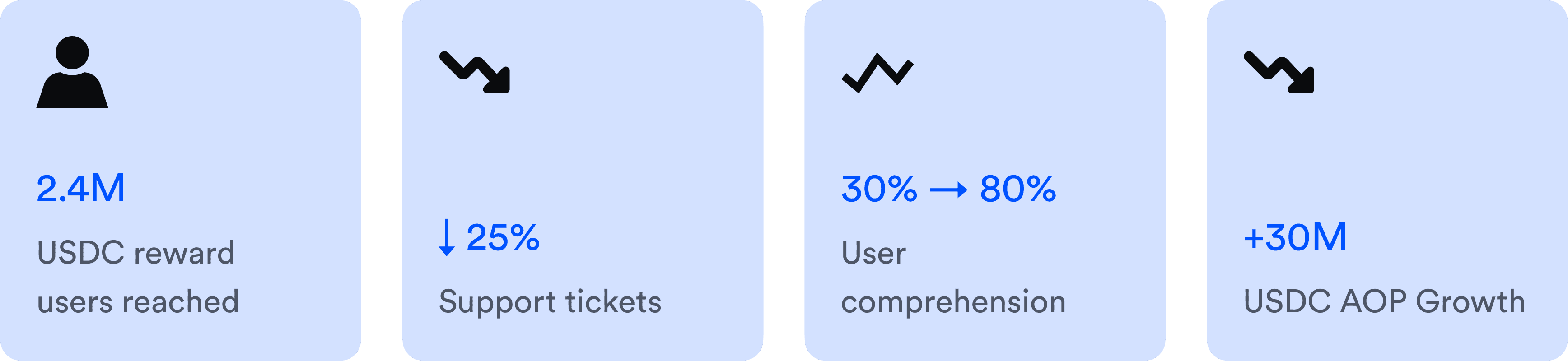
↓ 25% support tickets
↑ $30M projected deposits
2.4M users reached
Product Designer
8 Weeks (2024)
PM, ENG, Legal, UXR, Content
Figma, UserTesting.com

Challenge
The tiered reward structure confused users and eroded trust.
USDC Rewards is Coinbase's top growth lever, offering interest-like incentives for users holding USDC. Coinbase One members earned 5.50% APY on their first $30K of USDC, and 5.10% after that cap. But users only saw a single blended rate - like 5.33% - without context or breakdown. For those who upgraded for the boosted rate, it felt like a bait-and-switch. Confusion was suppressing deposits.

The old interface showed the output without the inputs – just a blended APY with no explanation of how it was calculated. Users couldn't reconstruct the number, so they stopped trusting it.
Solution Snapshot
Phase #1
Rewards Module Redesign
I landed on a solution that addressed user confusion (user goal) and achieved asset growth (business goal).
I made the rate row tappable, because surfacing the full breakdown on the surface would force the $30K cap onto every user before they'd chosen to engage with it. The tap gives users authorship of that moment.
On tap, I used a receipt-style breakdown that lets users reconstruct the blended rate themselves. I also separated the upsell card into its own layer because mixing education with conversion in the same space would have made both weaker.

Phase #2
Payout Visibility
I expanded scope to address a second trust gap identified in research.
I persuaded the team to go beyond the rate fix, because research showed payout ambiguity affected all 2.4M holders. I designed solution around three touchpoints: email for awareness, in-app confirmation for acknowledgment, and payout history for verification.

I then designed the end-to-end payout tracking experience, so users could verify every reward with a record they could trust.
I cannot show before & after here since it barely existed before :(

Impact
As we are rolling out the revamped payout experience, our data science partner expected us to achieve…
Research
I dug into data to diagnose where understanding broke.
I analyzed 500+ support tickets and interviewed 10 Coinbase One members.
"Why is my rate lower than advertised?"
Users felt their rate was a broken promise. The blended rate felt like a bait-and-switch.
0 of 10 could reverse-calculate the rate.
Users had stopped trying to understand. Beyond the missing explanation, they lacked the mental framework to process one.
Insight
Users couldn't trust a number they couldn't reconstruct.
This meant better explanation copy wouldn't fix it, since users had already stopped reading. I needed to design a structure they could reason through themselves. So I reframed the problem:

New Discovery
From research, I discovered a second paint point we hadn't considered: payout ambiguity.

These problems led to high support volume, low trust, less engagement, and ultimately fewer deposits. Fixing one gap while leaving the other open wouldn't move deposit growth.
So I proposed to expand the scope to address the end to end USDC rewards experience.
Phase 1
Hypothesis
If we make the mechanics behind the blended rate legible, comprehension will improve, trust will increase, and deposits will follow.
I defined three factors that guided my explorations against this hypothesis.
Decision 1
Progressive Disclosure over Full Disclosure
The $30K cap is uncomfortable information. The key difference between these 2 approaches is who controls the timing. I intentionally added friction because that gives user authorship of the moment, and anxiety decreases when users feel in control of what they learn.

Full Disclosure
vs

Progressive Disclosure
Decision 2
Bottom Sheet over Inline Expand
Inline expand can't contain the content without pushing everything down and disrupting the tab layout. It reads like a footnote that got bigger. A bottom sheet creates a dedicated, purposeful space that sits above the tab without touching it. It signals: this is a full explanation, not an annotation. That framing is what gives the breakdown enough weight to make the rate believable.


Explorations
I explored 6 ways to disclose the reward mechanics in 2 layers.
Each tested a different way to structure the tier breakdown inside the bottom sheet.

Optimizes for precision and clarity, but risks feeling dense if not balanced carefully.
From Exploration to Solution
I prioritized comprehension and trust without adding cognitive load, and the receipt best balanced all three.
"Boosted tier" and "Standard tier" labels map directly to the bracket mental model. Users see the structure that produces their rate. And the layout is scannable. The labels do the cognitive work, so users don't need to read paragraphs to understand the split.
"I have MORE than $30K of USDC"


"I have LESS than $30K of USDC"


Separating conversion from explanation.
To encourage additional USDC deposits, I collaborated with content and legal teams to craft a compliant, motivating upsell card.

User Testing
I learned and programmed user testing on UserTesting.com to learn about users’ feedback on this update.
➔ Before Prototypes: Only 3 out of 10 users could correctly explain the APY mechanics.
➔ After Prototypes: 8 out of 10 participants comprehended that APY could change based on their USDC balance.

Results
Clarity drives understanding and engagement
Improving APY comprehension directly reduced user confusion and support load, while the upsell card and breakdown drawer drove meaningful engagement. These results validated that designing for clarity first unlocked better user trust and platform growth.

Moving onto Phase 2
Phase 2 closed the trust gaps in user communication and in-app experience.
Scalable email templates
I partnered with the Design Systems team to create a customizable email template.
Other teams can surface upsell opportunities like Coinbase One promotions alongside reward communications. This approach made the reward experience feel complete for users, while also supporting longer-term growth initiatives.

End-to-end rewards payout flow
To reinforce trust and drives growth, I designed a transparent in-app experience across key touchpoints.
Confetti celebration screen creating moments of delight upon payout
In-app payout history providing reward tracking over time
Push notifications alerting users when rewards are deposited
Implementation
Bringing design to life
To balance engineering constraints & business priorities, I partnered with PM partner to devise a phased rollout plan.
Technical: Integration with transaction systems required refactoring
Business: Legal compliance required specific disclosures

Learnings & Takeaways
Look beyond surface problems to uncover deeper user needs.
The obvious problem isn't always the most impactful. By digging deeper into support tickets, user interviews, and shadowing support calls, I discovered that user confusion was beyond unclear APY—it was about fundamentally lacking trust in how rewards were communicated. Addressing the real issue turned user frustration into confidence.
Balance clarity and business goals to build user trust.
Design isn't just about clear visuals—it's also about transparently aligning user needs with business objectives. By iterating rapidly on APY explanations and collaborating with legal, product, and content teams, I found a solution that significantly improved user comprehension and drove substantial platform growth.
Design end-to-end experiences to maximize impact.
User trust isn't built by fixing isolated touchpoints. By carefully designing each stage—from initial APY clarity through to rewarding payout notifications—I delivered a cohesive, transparent experience. This comprehensive approach reduced support tickets and became a model for other Coinbase product flows.
