Built an engagement dashboard from 0 to 1 to help small businesses turn customer data into actionable strategies.
Role:
Sole Product Designer
Timeline:
15 weeks from concept to pilot MVP
Teams:
2 Founders, 3 Engineers
Tools:
Figma
Background
Customer engagement tools today are not driving retention for small businesses.
Small business owners need something simpler than enterprise CRMs.
Underutilization
Of loyalty programs that consumers are a part of that have become inactive
Poor Perception
Of consumers have a negative perception of loyalty programs
Financial Liability
in unclaimed loyalty points sit as financial liabilities
Challenge
How might we help small businesses turn customer data into clear, actionable engagement strategies?
Early Attempt
Version 1 looked tidy, but failed during usability tests.
70% of merchants couldn’t find a next step in the first 60s.

I dug in and realized that we were shipping data, not decisions.
Structurally, the metrics and layout were clean and understandable. But there was an assumption that users already knew what they were looking for. That wasn’t true.

Figuring out the root problem
The real problem was about the system.
The old information architecture listed facts but skipped the insight. And without insight, users couldn’t take action. That’s the behavioral gap I had to close.

Solution - Restructuring Information Architecture
As a team, we rebuilt Information Architecture with users' own language, replacing passive metrics with action cues.
We revisited interview notes, pulled the verbs users repeated most, and grouped them. In a whiteboard jam with the founders, we relabeled and reordered the nav so every KPI links straight to a tool that acts on it.

I also restructured the content hierarchy, giving every section a clear direction.
Each block now serves a purpose: spot changes, track performance, or suggest the next step.
Home page with updated hierachy
How might we guide users to act on insights?
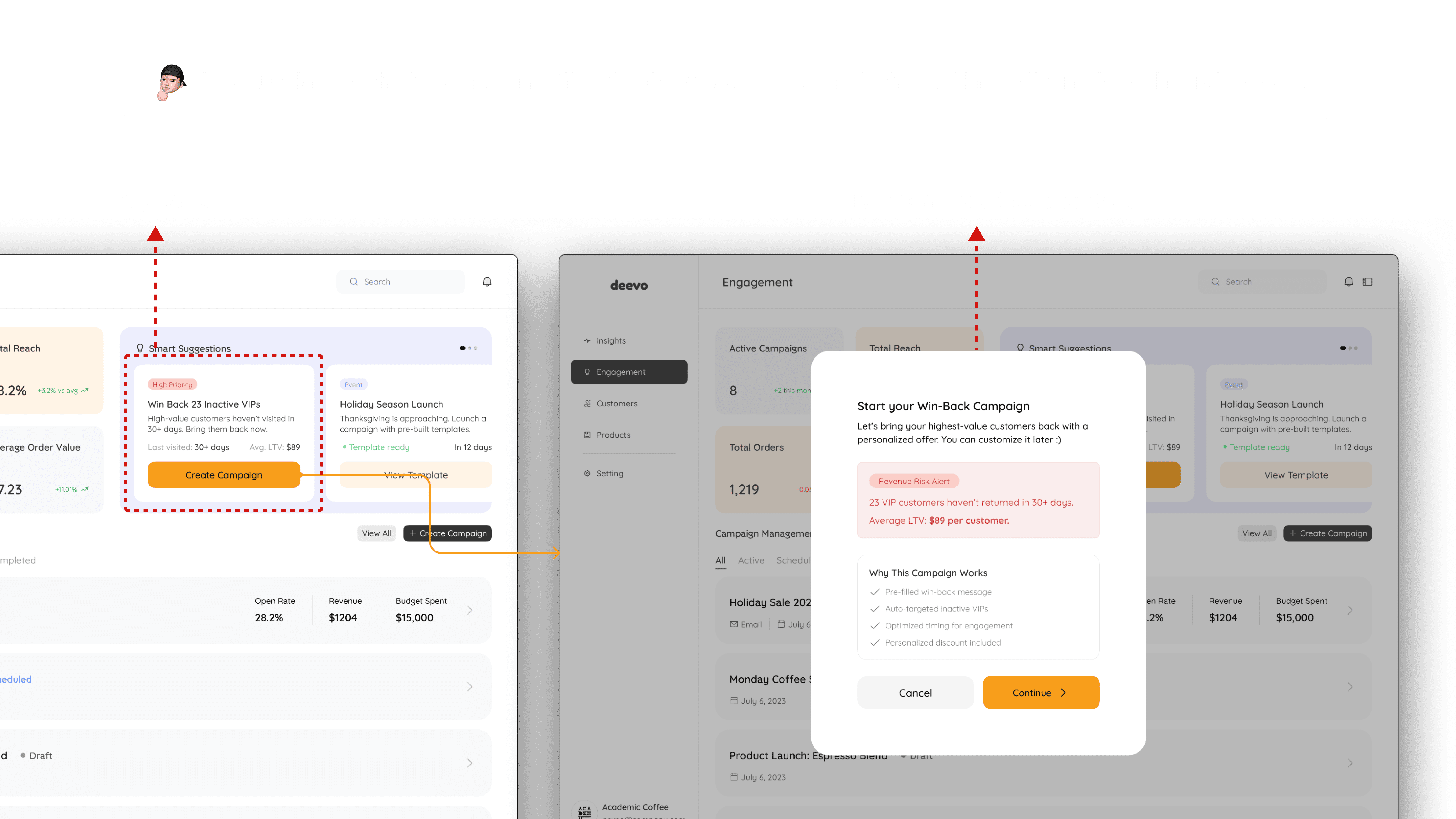
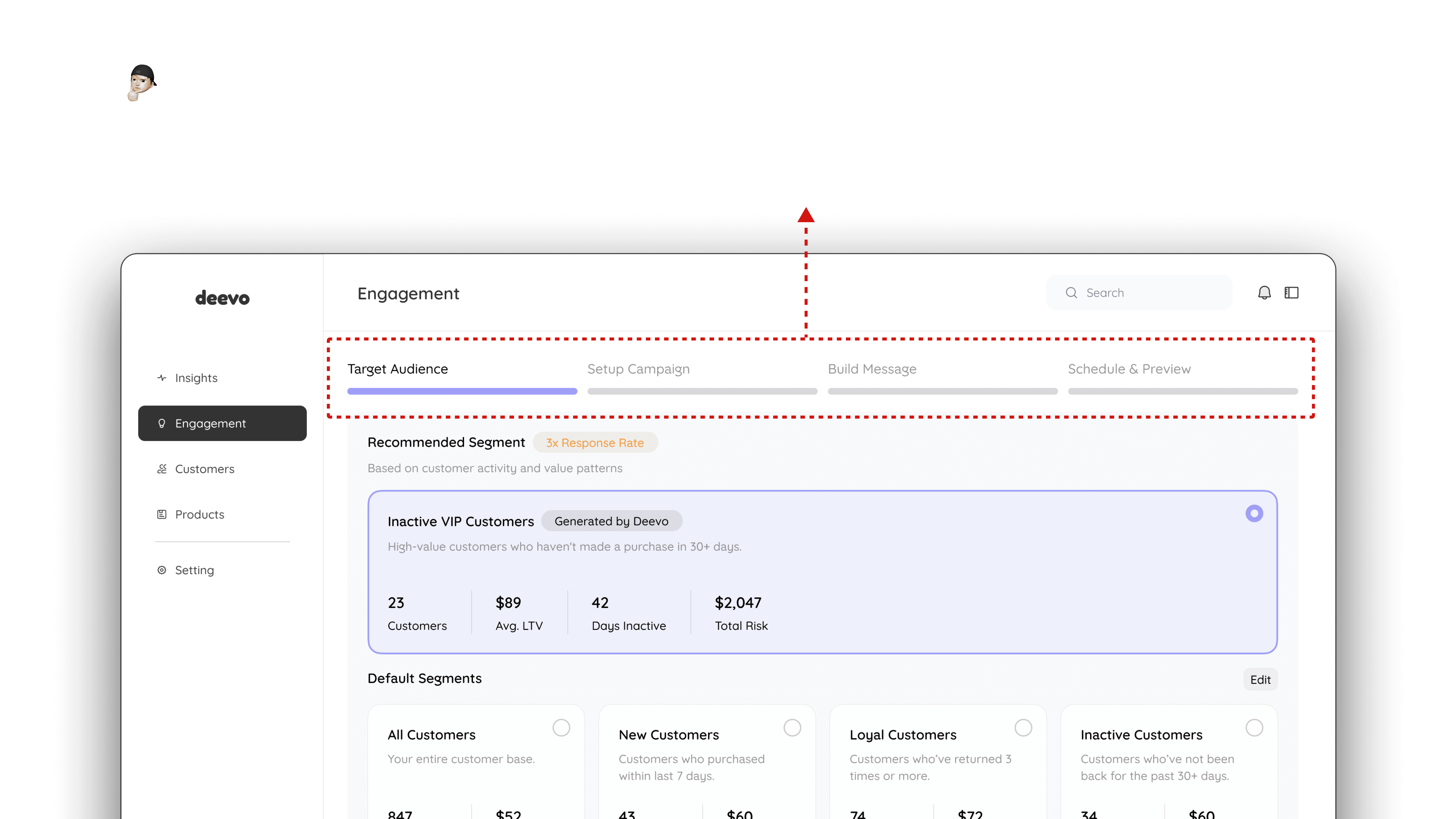
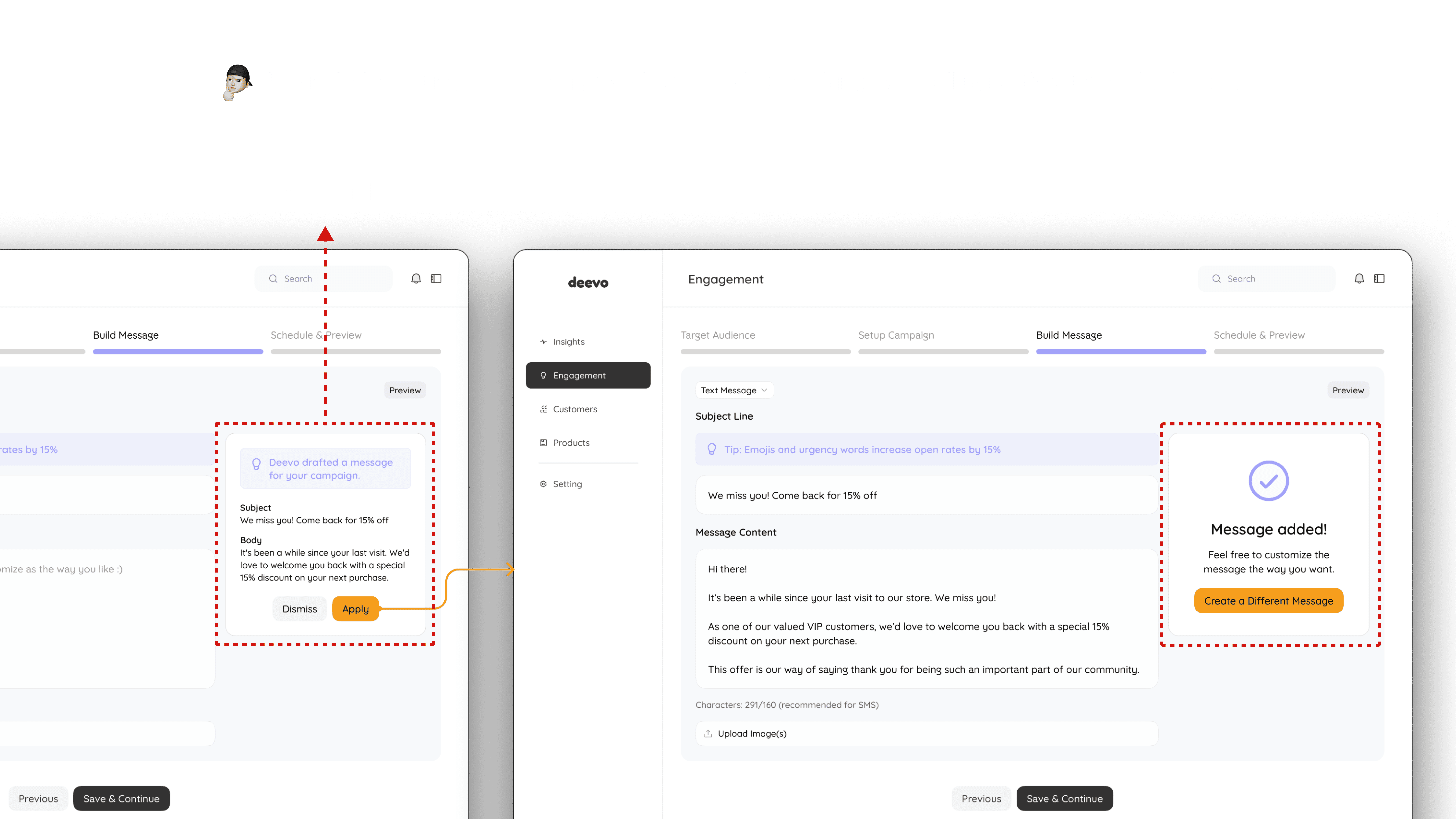
Seeing what's happening is only half the job. To help users do something, we introduced Engagement, a space where each insight becomes a ready-made campaign they can launch in seconds.
Adding the Action Layer
I translated user stories into Engagement, a flow that converts insights into guided, one-click campaigns.
Design Explorations
I prototyped four paths to action before converging on the guided campaign creation flow.


Solution
Explorations showed that merchants need guidance that feels smart but not overwhelming.
So I landed on a system of action-driven suggestions, contextual guidance, and just enough automation.
It combined merchants' need for clear next steps with engineers' need for scalable patterns.
Closing the loop from metrics to action
Outcome
We measured impact at three levels: feature adoption, user value, and business value.
1 - Feature Adoption
Most merchants chose the guided path.
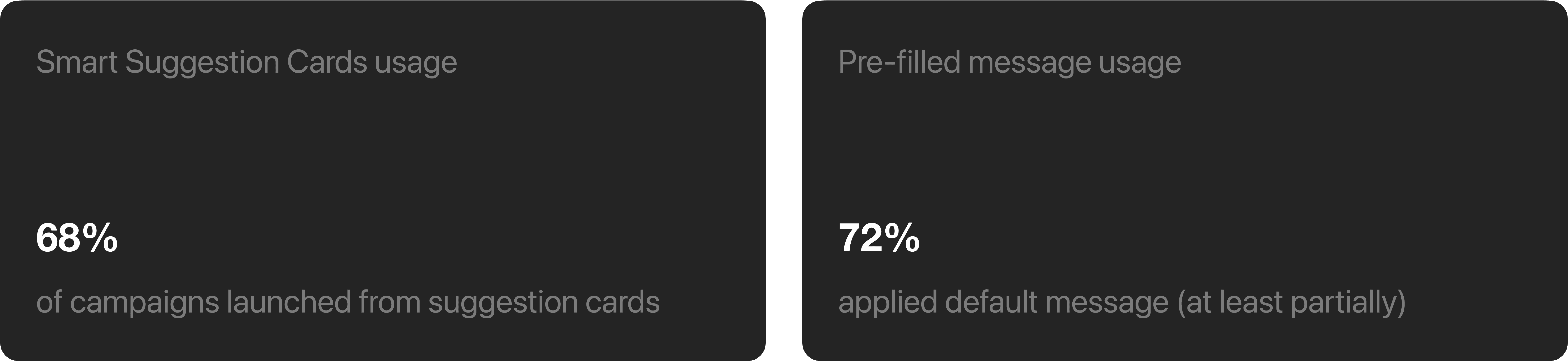
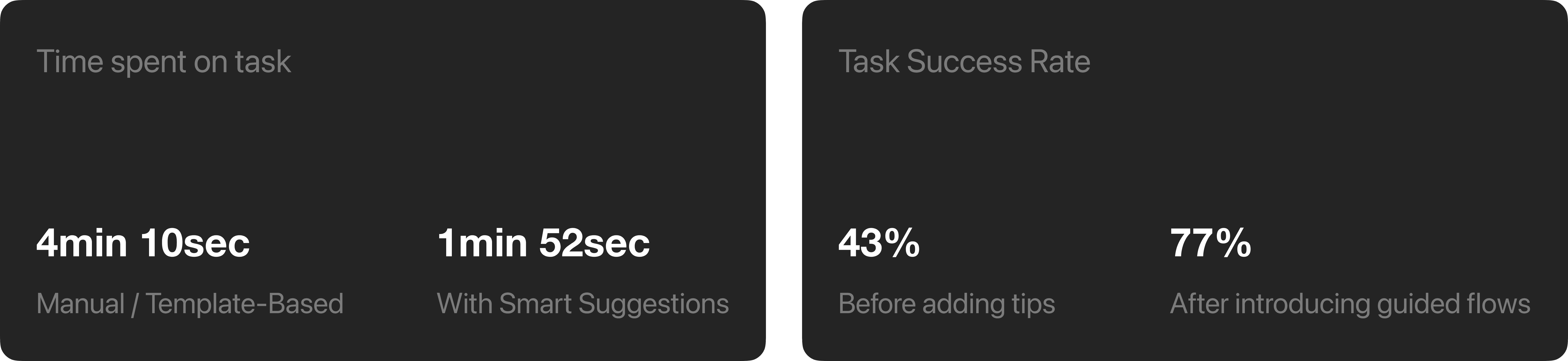
2- User Value
Faster, more successful campaign creation.
3 - Business Value
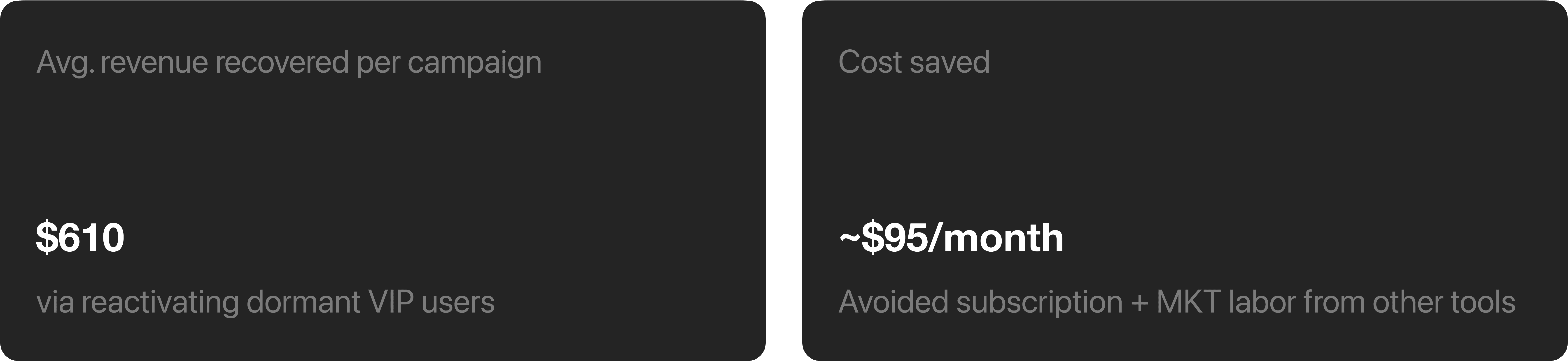
Revenue recovered and costs saved during a 4-week pilot with 3 local cafés.
Takeaways
Don’t make users assemble the puzzle themselves.
The failure of version 1 pushed me to replace “show the data” with “suggest the action,” closing the gap between metrics and movement. Users shouldn't need to interpret, guess, or piece together how something works.
Challenge assumptions sooner, not later.
Our initial approach assumed that solving the surface-level pain points we observed would unlock value. If I did this again, I’d question assumptions earlier — zooming out to confirm we were even solving the right layer of the problem before sketching anything. I took that mindset to future works, and it paid off.
Prototype edge cases early.
We started with a clean, happy-path demo, then scrambled when real data came in empty or dirty. If I could do it again, I’d build edge-case states into day-one prototypes to surface gaps before they hit production.
Design for stateful systems that scale.
I started by building components individually, focusing on immediate needs. As the product grew, maintaining consistency became increasingly difficult. Next time, I’ll define shared patterns and states up front so the UI scales smoothly instead of patching a system later.
